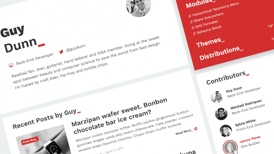
Design Process Behind Our New Development Blog

Sometimes people mistake web designers’ job to be picking colors, appropriate typography, defining elements’ sizes, but it’s so much more than aesthetics – especially in this case, where myself, as one of the web designers, had to portray the already existing Studio Present brand into its new family member: Studio Present Development Blog, while still maintaining its function.
The first step of mine while going through the design process is creating a mood board with words and colors. What do I want to portray? How should this design be inspired by other similar designs?
Synthesis of Development Blog’s parent’s design elements with motives related to development was my main goal. That’s why I’ve started writing some key words which reminded me of two things: Studio Present and development - red, black, white, terminal, braces, dots, flat, programming, team, people, code, underscores, slashes, backslashes, light, fast, highlight, shapes, squares, triangles etc.
Obviously, I have gone with red and black, since those are the key colors in our brand's color scheme. Since I’m a big fan of using big type and big whitespace (it’s 2017, not 2007), I’ve decided on using one of my favorite web fonts lately – Work Sans. It looks sleek and modern in any of its weights, and it surely goes well with my mood board.
Next step: sketching and wireframing. I’m one of those people who always use pen and paper. Nothing feels like pen and paper, in my opinion. There’s something about that black-pen-on-white-paper look that makes me even more creative. I tend to sketch blocks, instead of full pages. It’s easier when you modularize things into smaller pieces, because that way, you can play with those blocks later.
After I was done with sketching, I’ve switched to Adobe Photoshop CC 2017. I’m still not used to Adobe XD, but I sure do try things in it now and then. It lacks some of the features I need, but that’s a whole another story to tell. Back to the design of the Development Blog.
Flat. Light. Fast. Because of those key words, I’ve decided on using basic white (and red) shapes without any shadows or embossments. Big and bold typography, sometimes followed by red underscores, monochromatic imagery… It just goes well with the theme of web development and coding. In a way, I have wanted to portray a design which resembles a simple, basic code in a terminal. But in a design-y way. Underscores here and there, slashes as menu items dividers, curly braces, angle brackets… it speaks well that this is a development blog in the making.
Good design needs to breathe. Content needs air and space. It needs to appeal to website’s users. If you get the design wrong, your website is just another website. And of course – I don’t expect this design to be perfect when deployed – there will be sure some stuff that needs fixing. That’s why web design is an ongoing process that, contrary to the belief, requires constant maintenance. It’s never finished and that’s the beauty of it.
Oh, and by the way – ASCII version of our logo located in website’s footer is, in my opinion, a cool touch. What do you think about it?


